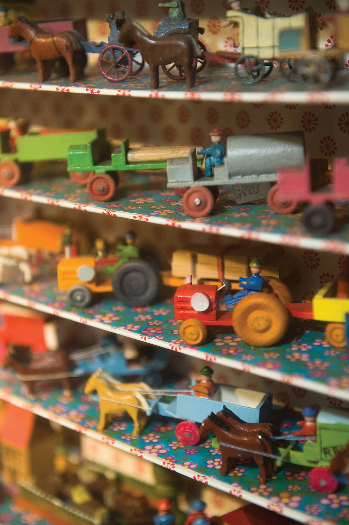
LONDON LUXURY QUARTER art direction:
The World’s preeminent shopping and leisure district.
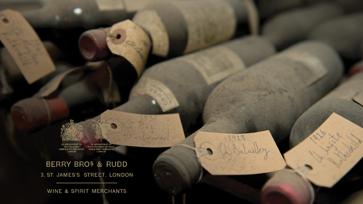
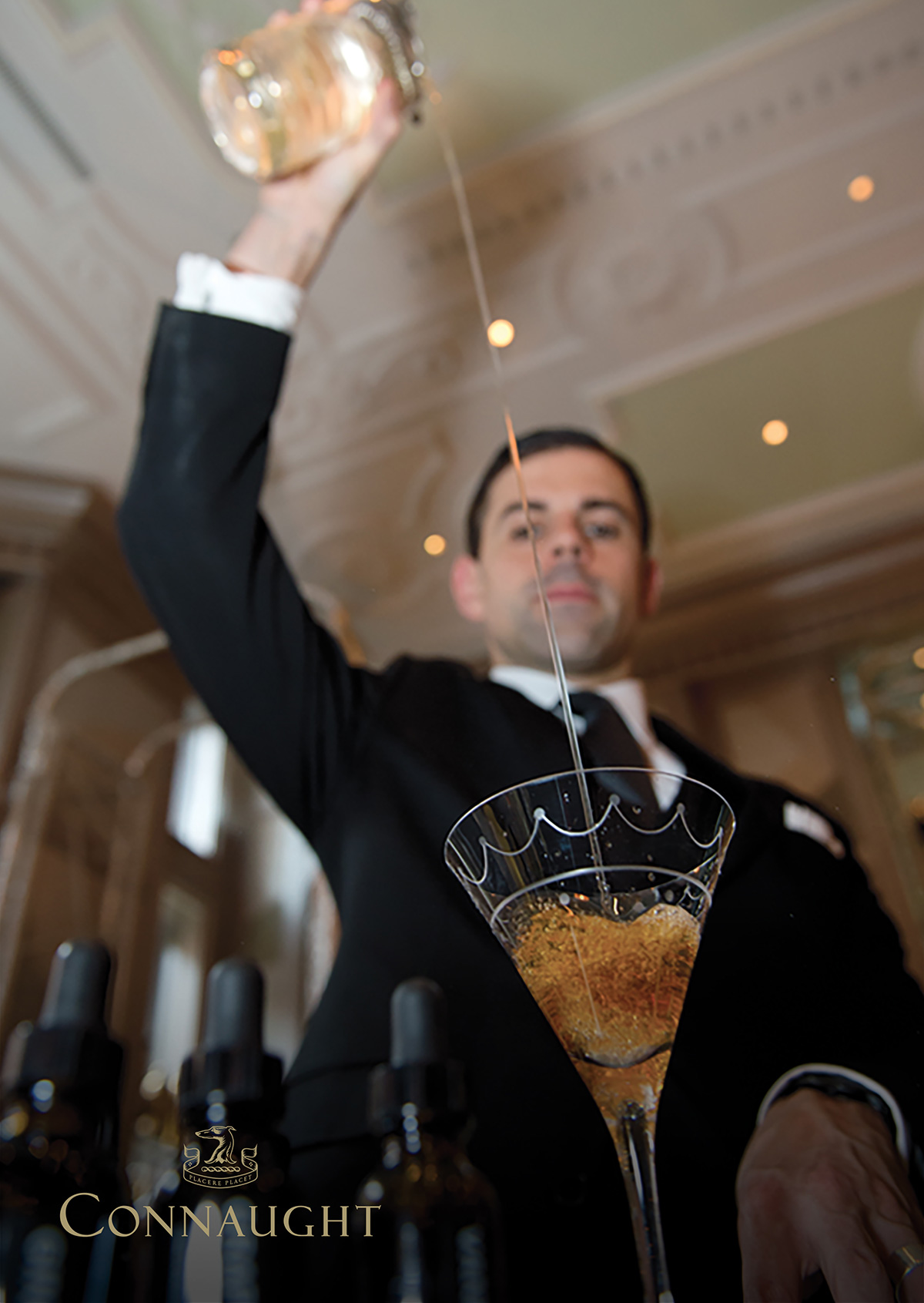
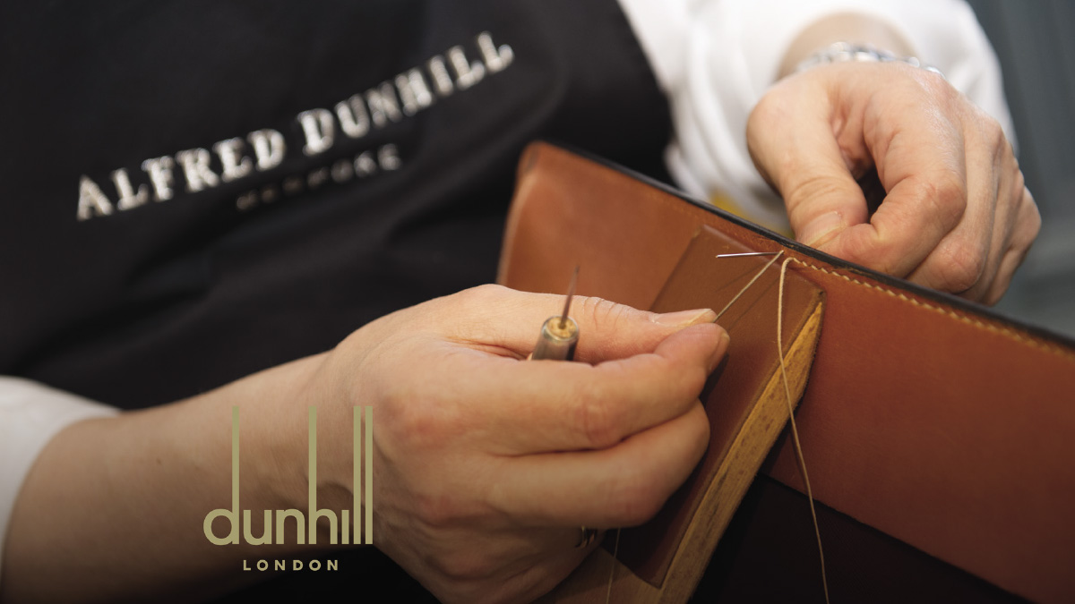
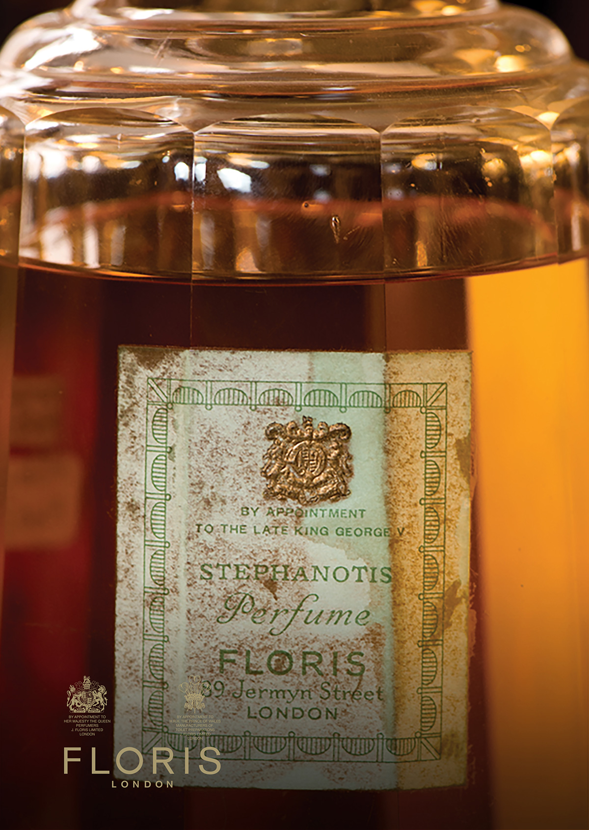
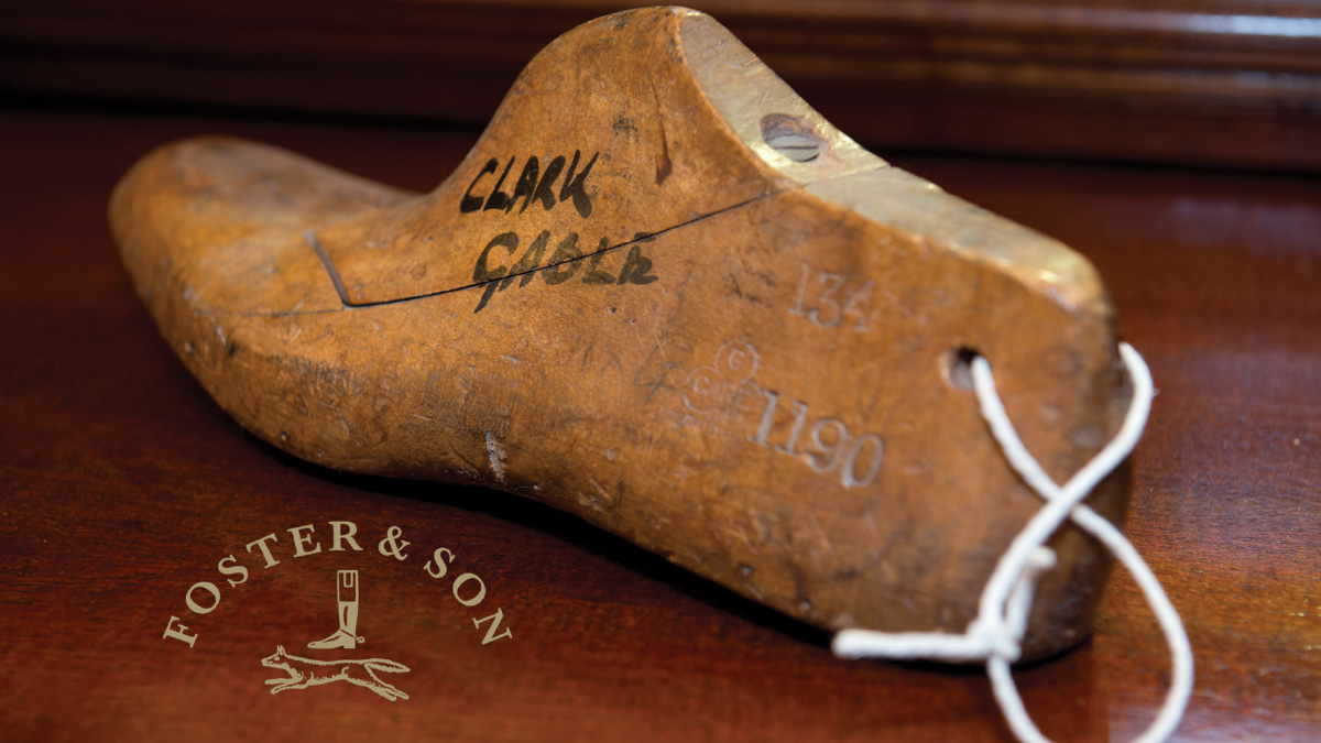
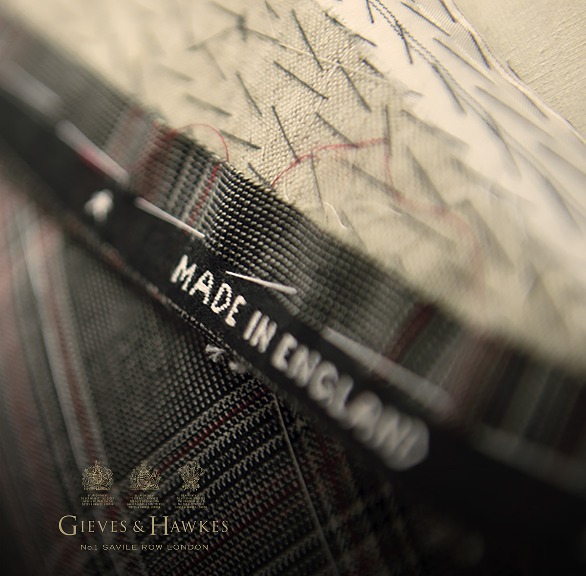
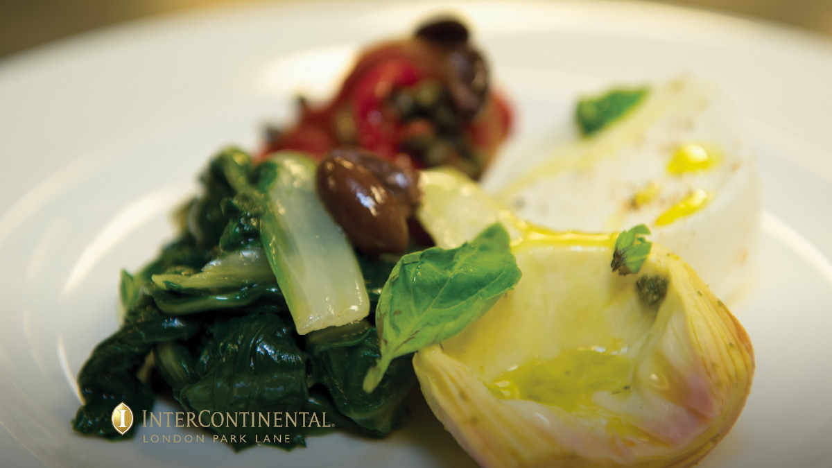
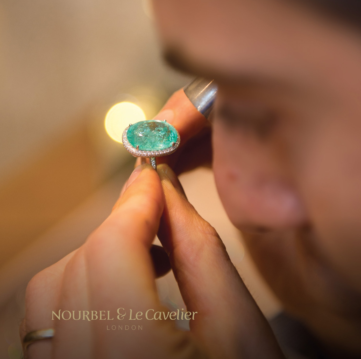
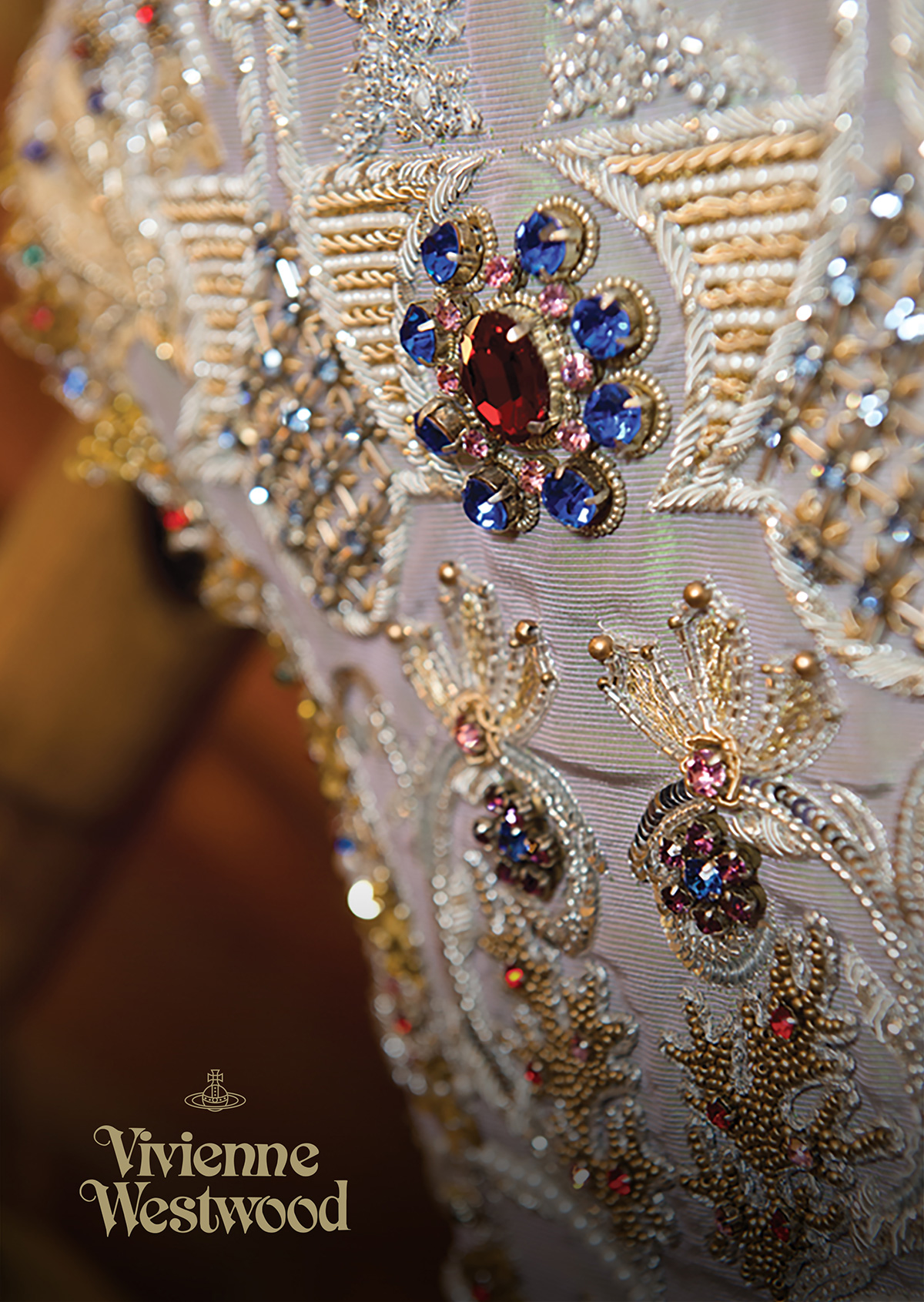
The historic area of Mayfair, St James’s and Piccadilly as London’s Luxury Quarter, is anchored around New and Old Bond Street, is an area synonymous with world-class luxury and leisure, providing generations of exceptional service and hundreds of years of heritage.
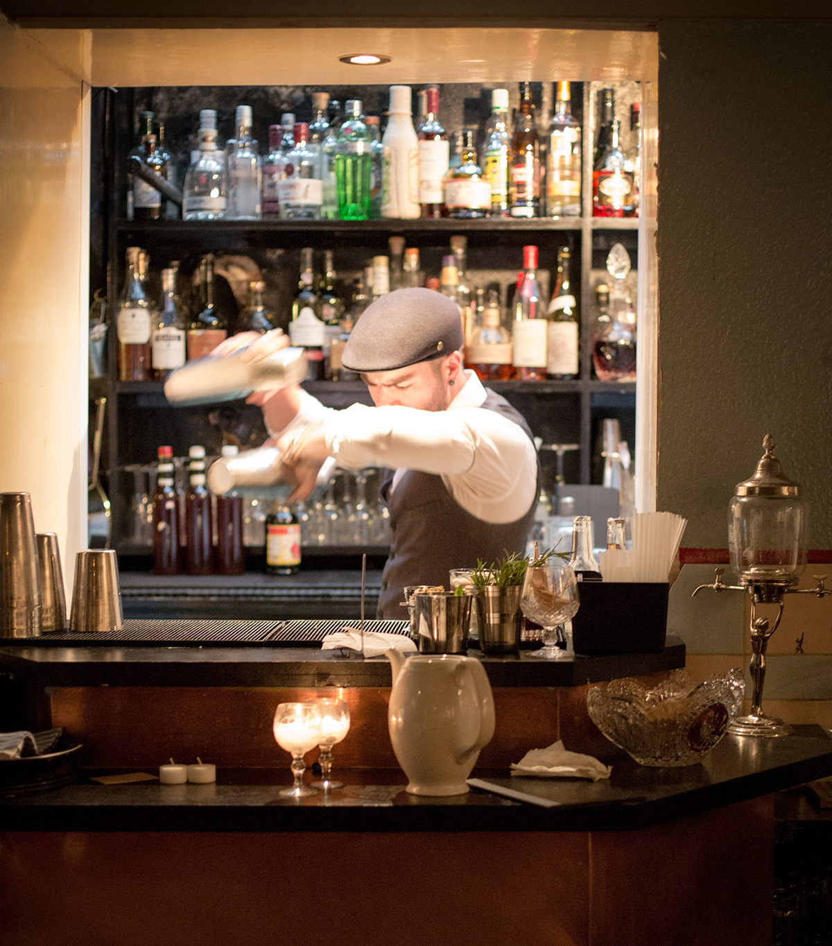
London Luxury Quarter’s ‘By Appointment’ service is an invitation only service aimed at international
High Net Worth individuals and families. Providing guided tailor-made shopping, leisure and cultural
itineries, in addition to exclusive events and experiences.
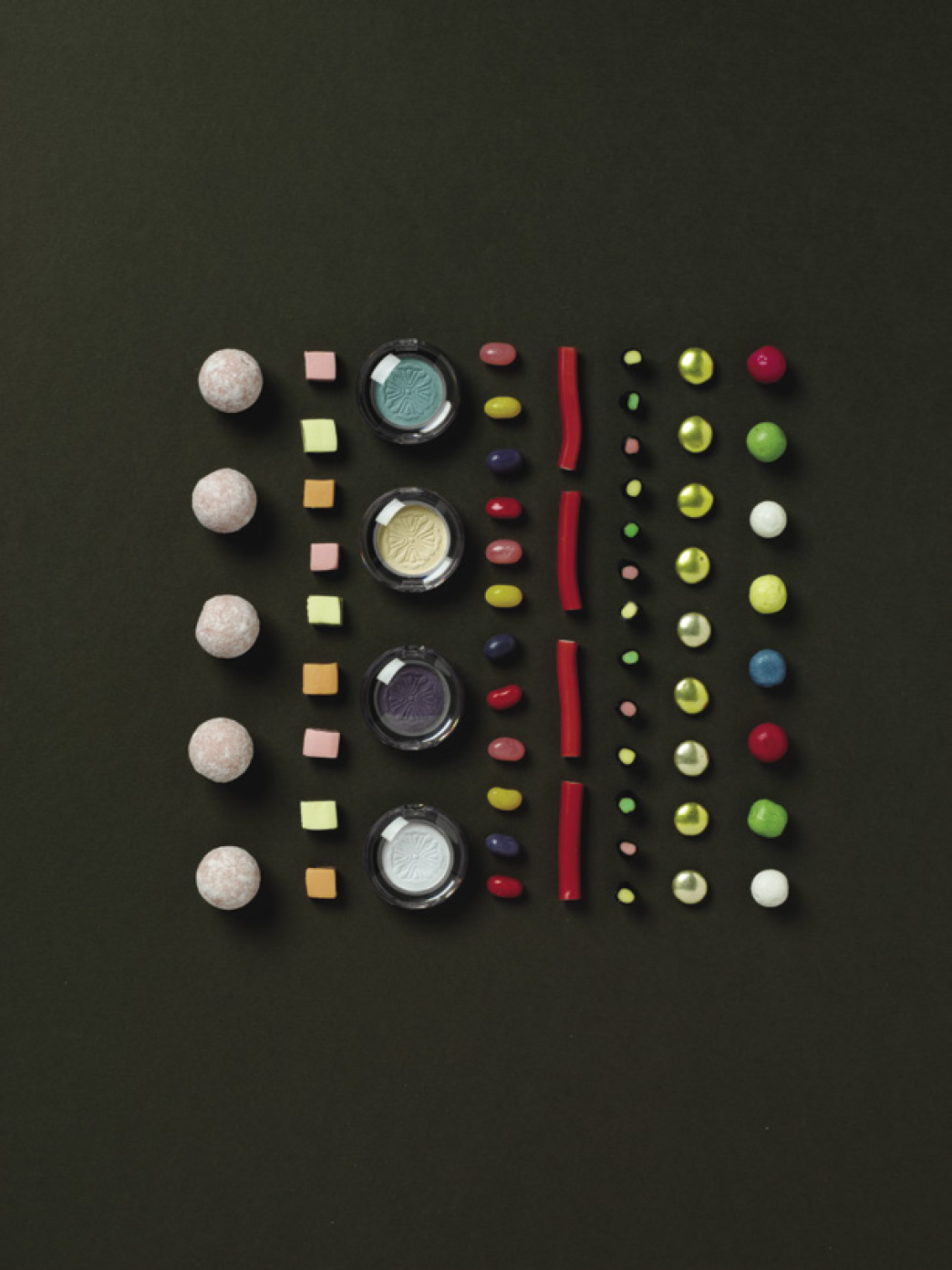
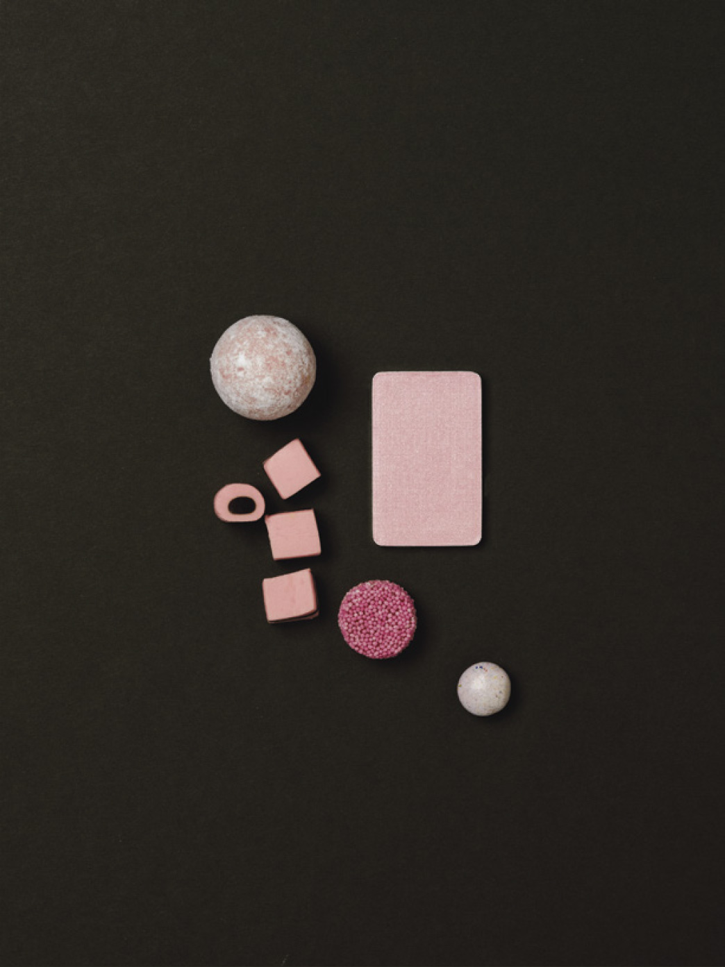
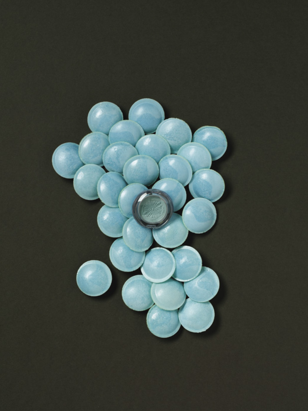
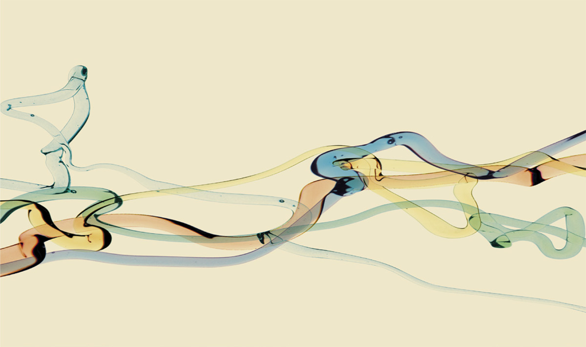
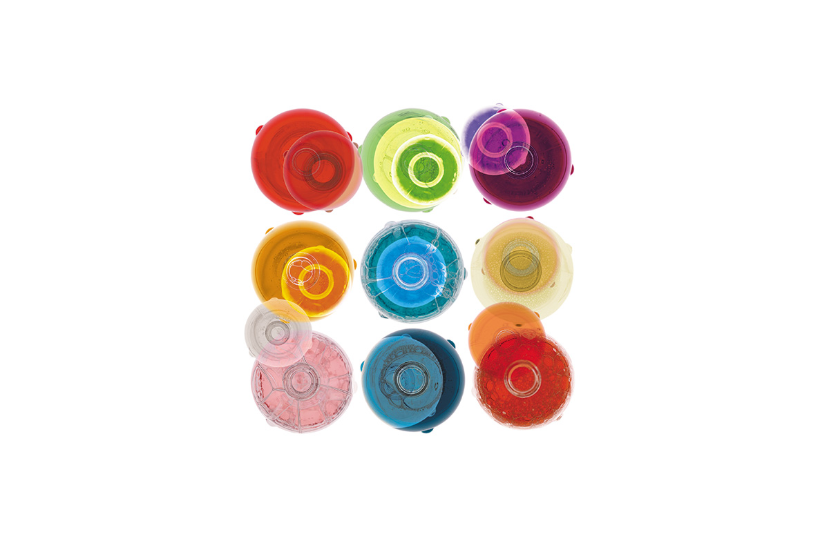
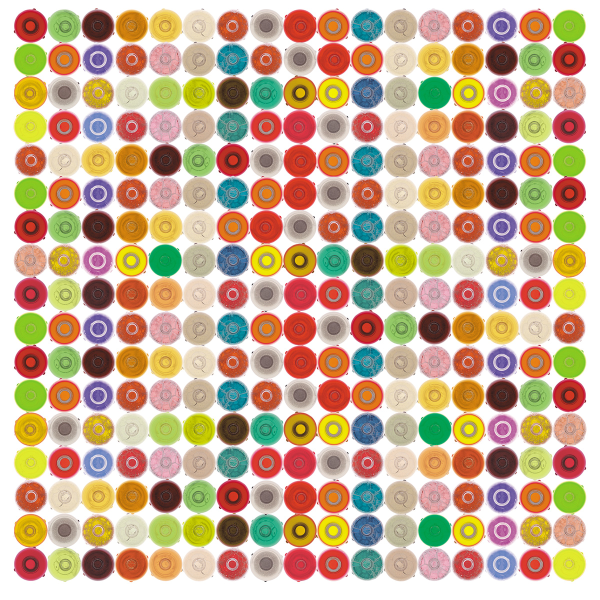
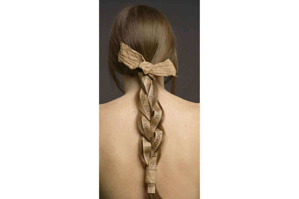
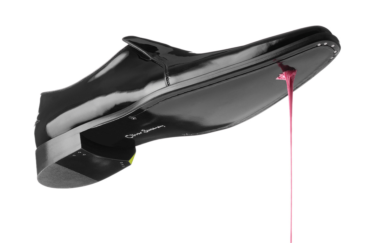
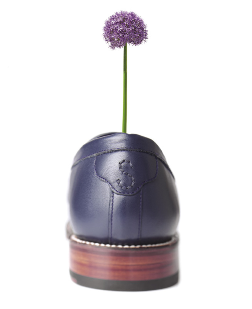
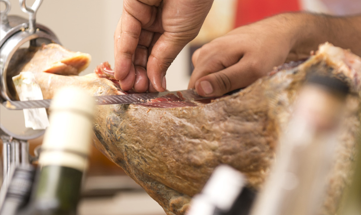
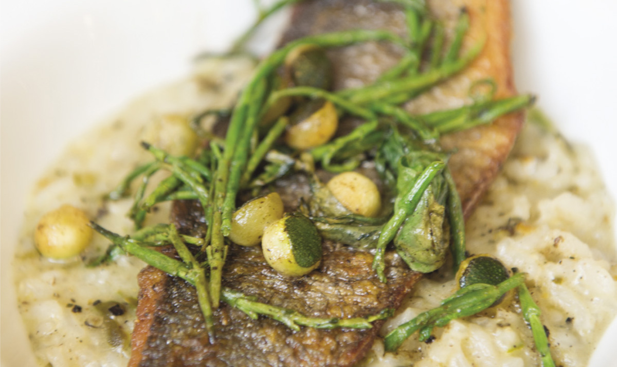
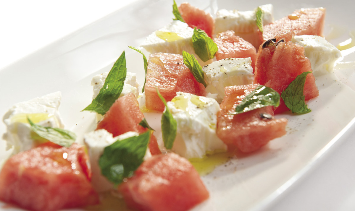
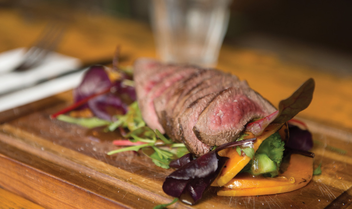
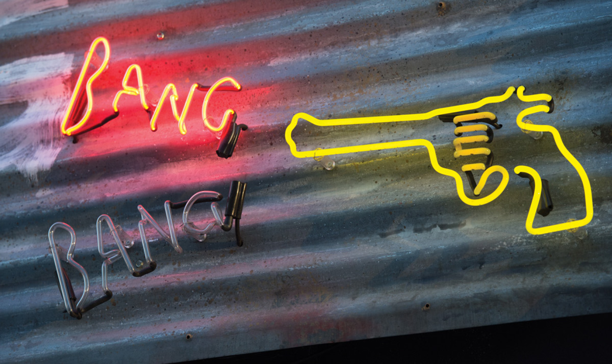
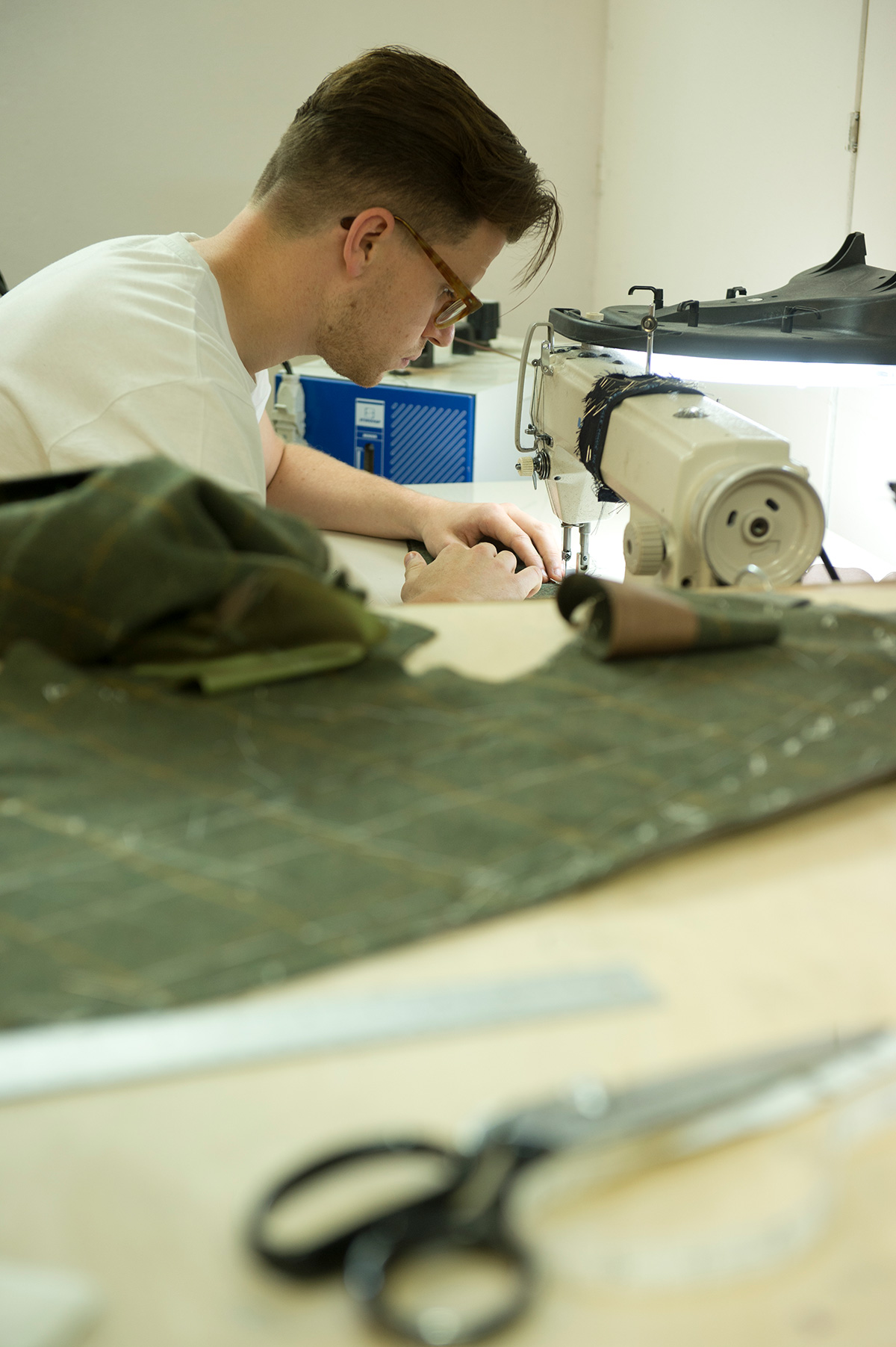
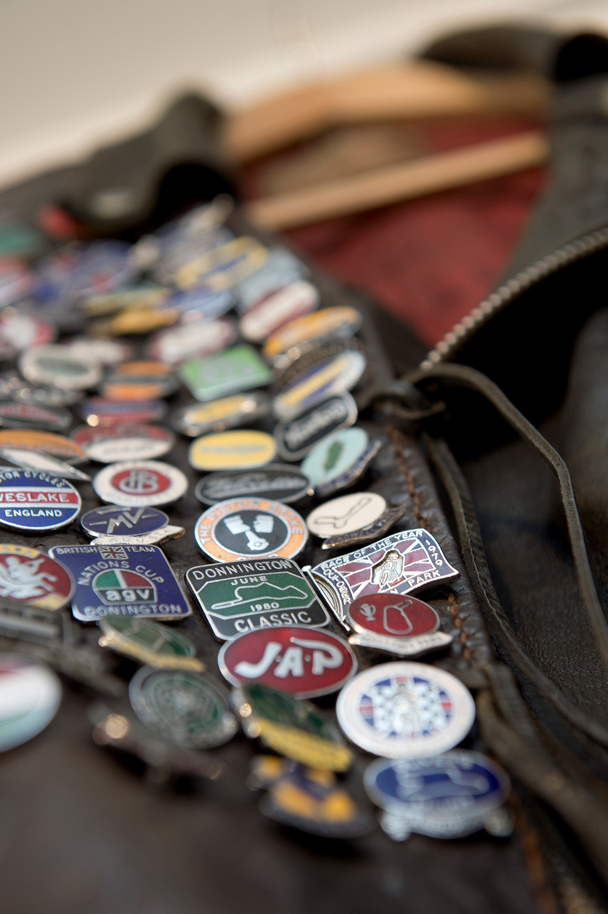
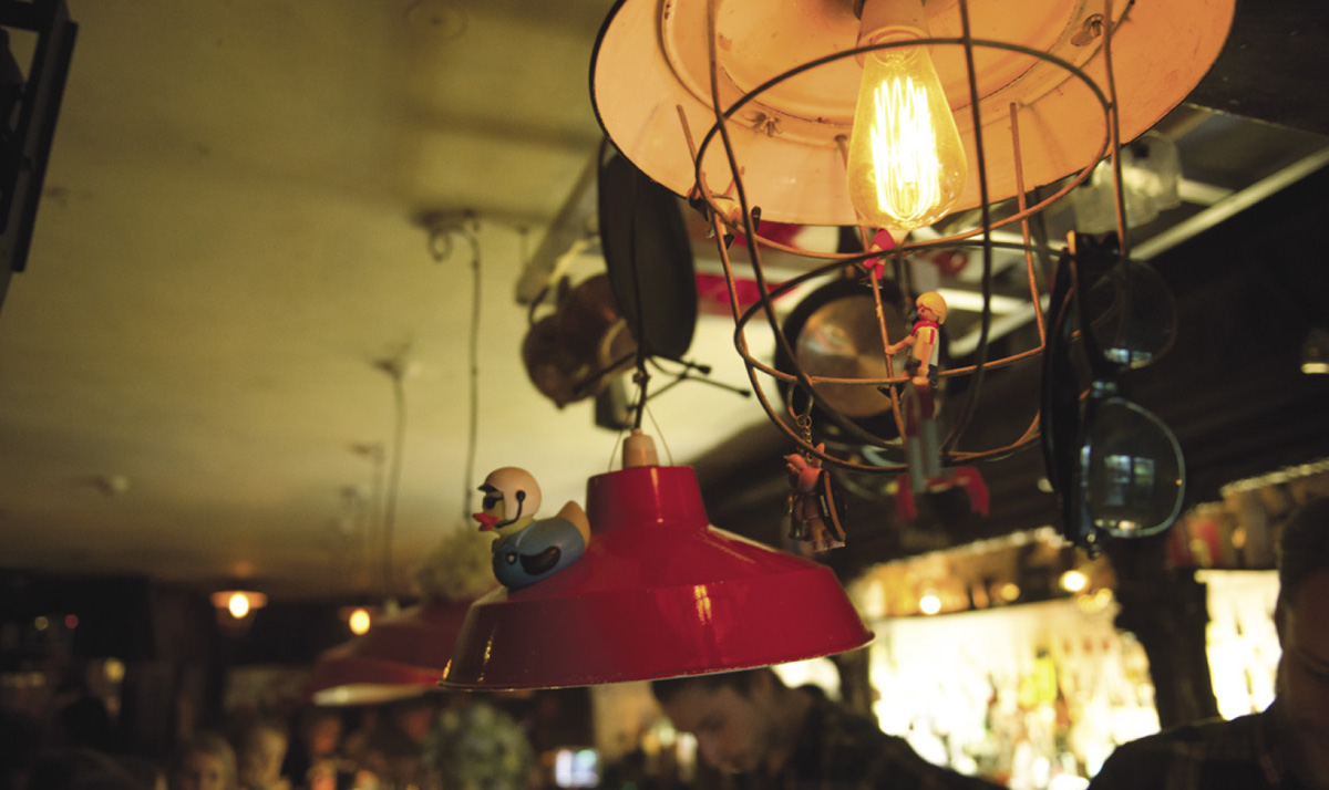
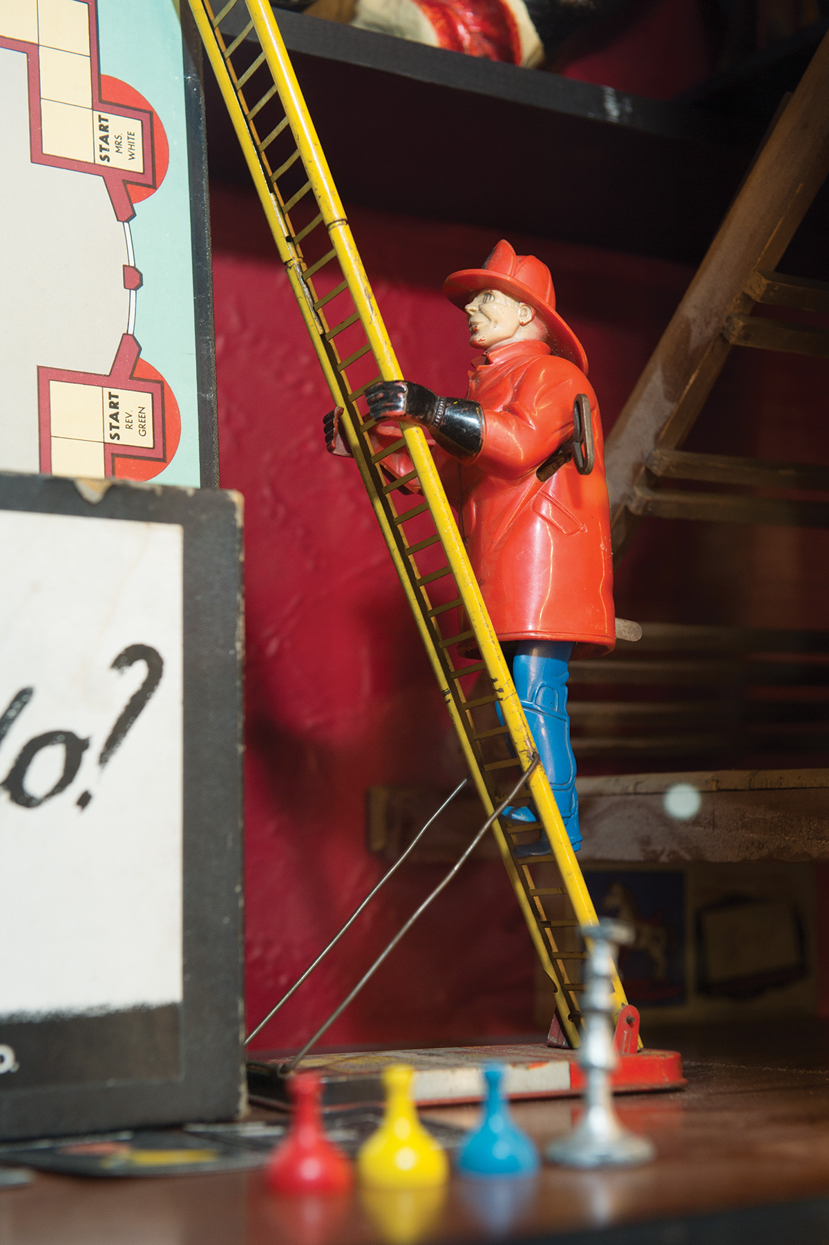
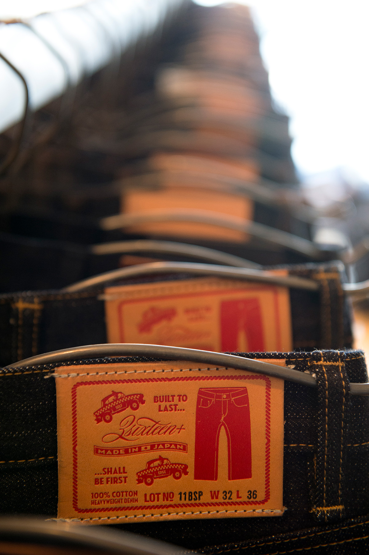
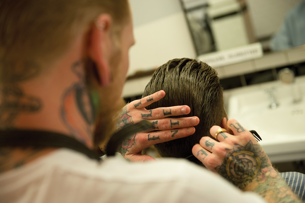
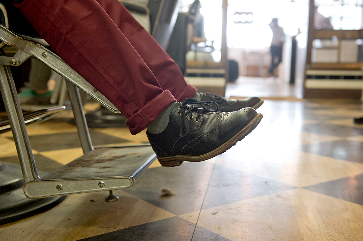
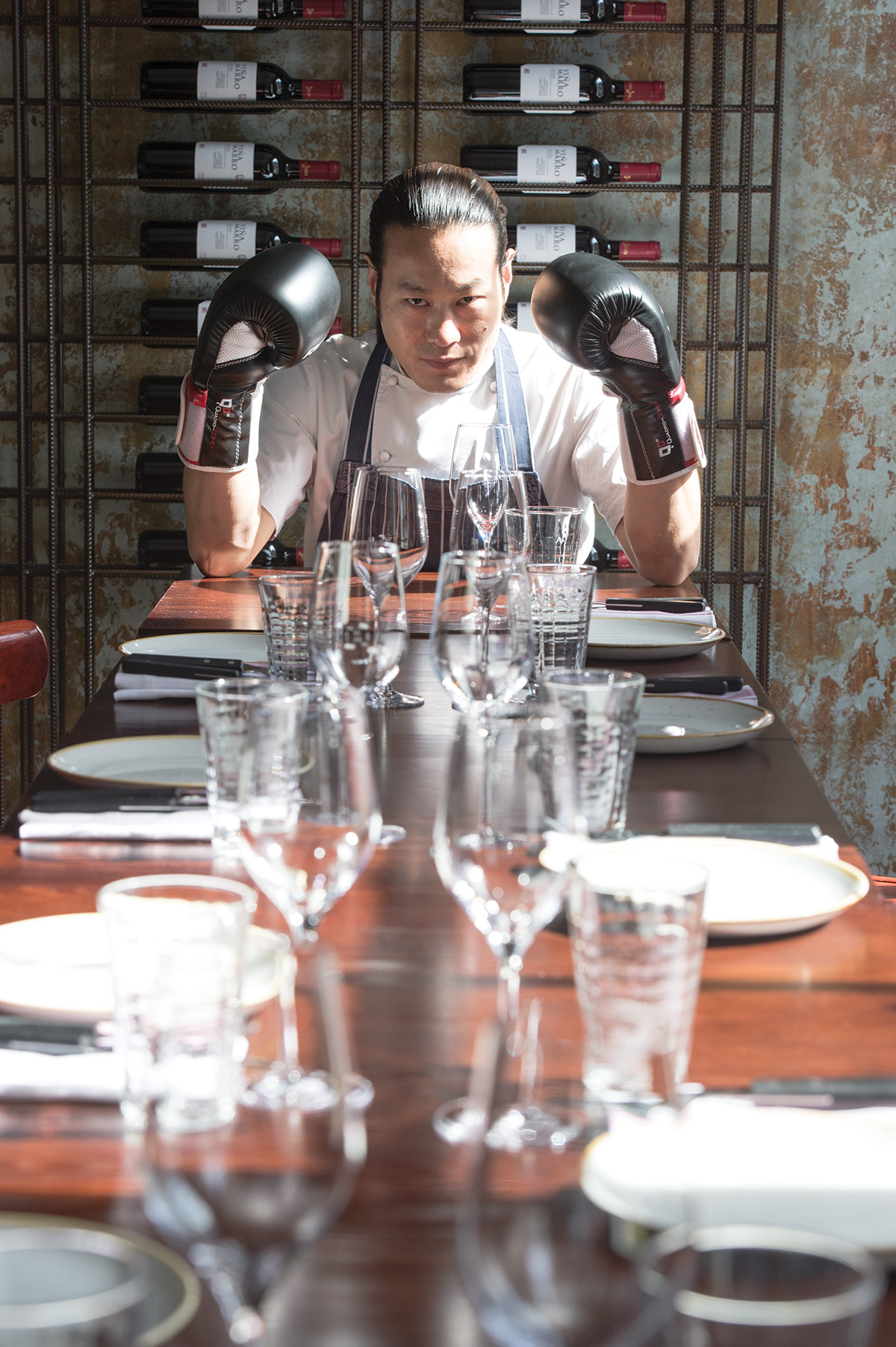
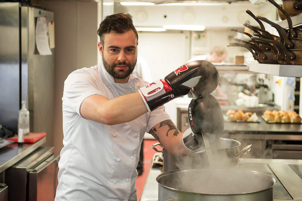
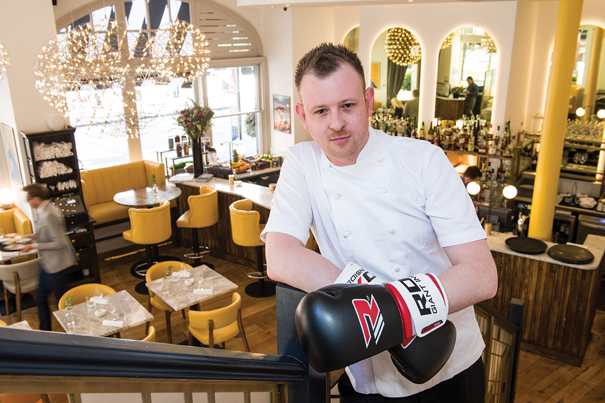
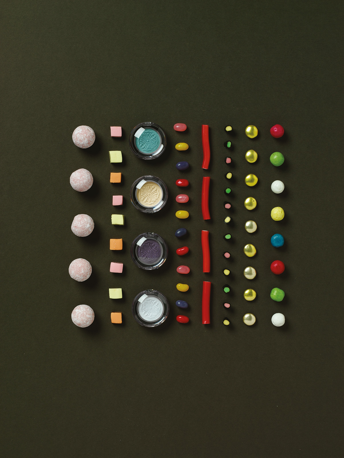
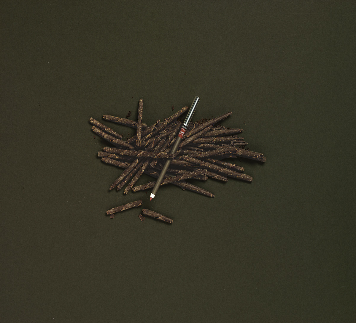
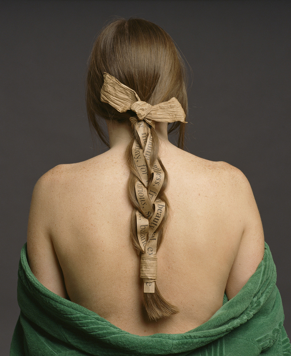
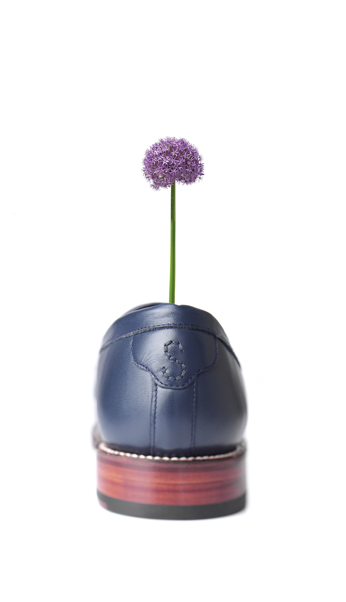
To reflect the unique and bespoke offering of the service, photography was shot to capture a visually
unified and seamless collection of brands.