CAFÉ ROUX identity:

An eponymous brasserie style brand and product offering from the globally renowned Roux gastronomic dynasty.
Using the words Café and Roux as ingredients mixed together to create the combined mark through an abstract play on the form of a chefs ladle.

The fusion of the F and U is a further element representative of the merged international origins of it’s menu.

BIRD STREET identity:

A pop-up retail & leisure destination and London’s first sustainable Smart Street - generating c5 watts of continuous power per pedestrian footstep.

The logo was developed taking creative references from the triangular fold forms of the bespoke retailer pods, designed by HHD, with the colour palette mirroring the scheme. The font based on Agenda Light was developed to include angular cuts making further reference to the architectural design and the smart flooring.

FESTIVAL OF FURNITURE identity:

A five day series of individual retailer events promoting the multiple furniture and homeware offerings located in London’s Fitzrovia.

The festival emblem took it’s inspiration from the dovetail joint featured on the decorative tiling on the facade of the 1917 Heal’s furniture building, a renowned landmark within the district. 

A reference to joinery was further utilised by using a carpenters pencil to ‘hand draw’ the two interlocking F’s of the logo.

The adapted ‘wood cut’ font was developed taking its aesthetic from the 19th century arts and crafts movement of which many creative protagonists, synonymous with the area, are associated with.

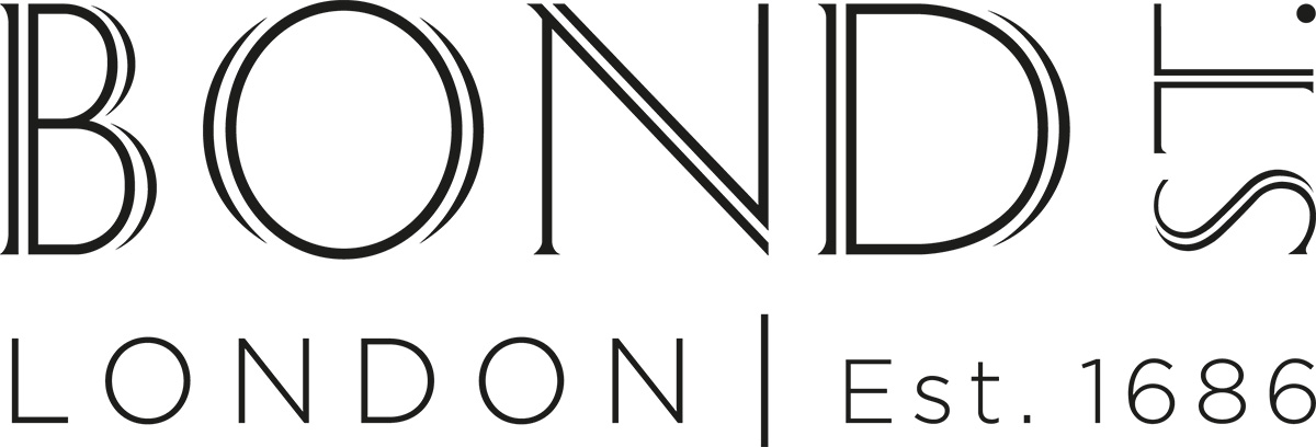
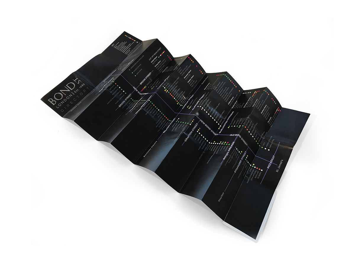
BOND STREET identity:

London’s capital of luxury retail and leisure.

Formally consisting of Old and New Bond Streets, and divided only by a small pedestrian area,
the two streets are collectively known and referred to as Bond Street.

The brand development strategy focussed on it’s geographical location, London, and the date of
it’s origin, 1686, which were included in the brand mark to emphasise it’s unique provenance and
premium district location.

The font took design references from 17th century typography, with an open multiline aesthetic
subtly referencing the two streets which make up the whole.

FALDO HOTELS & RESORTS icon identity:

Eponymous leisure brand from one of the worlds most successful golf player.

The icon is formed by three water splashes and three blades of grass - taking reference from Nick Faldo’s three Major and three Open Championships - interlocked to form an F. The curvature of the elements were by tracing the motion of Faldo’s golf swing.

The colour palette was created using the blue from the Royal & Ancient Golf Club of St Andrews,
the founders of The Open and the green from the winner’s jacket of The Masters.

JIMMY BEEZ identity:

Brasserie style restaurant.

Located in London’s famous Portobello Road, a handrawn font was created to reflect both the relaxed nature of the restaurant and it’s ‘melting pot’ of cultures location.

Elements of the logo were further utilised to create graphic iconography across menus, signage, 3rd party brand collaborations and merchandise.

PLATINUM BAY identity:

Luxury residential development.

Sited on the west coast of Barbados, next door to the world famous Sandy Lane Hotel, this exclusive
development consists of five detached beach-front villas in a five star managed community.

The identity emblem of an interplaying P and B was inspired by the tropical wind swept arched palm trees, the curvature of a coconut and the gentle lapping of the Caribbean sea, all synonymous with
the spectacular location.

ONE WIMPOLE STREET identity:

Royal Society of Medicine’s conference and events venue.

Housed in a traditional Georgian building, the new identity was developed to create a contemporary
and contrasting brand mark that reflected the leading edge offering of the venue.

By integrating One, Wimpole and Street into a single ‘word’, the new identity resulted in
substantially improved stand-out, specifically online where the brand competes against other venues
through specialised listings.

The font took it’s inspiration from the lettering on the exterior stonework with the teal colour
being a reference to the Victorian snake sculptures which feature at the entrance to the building.

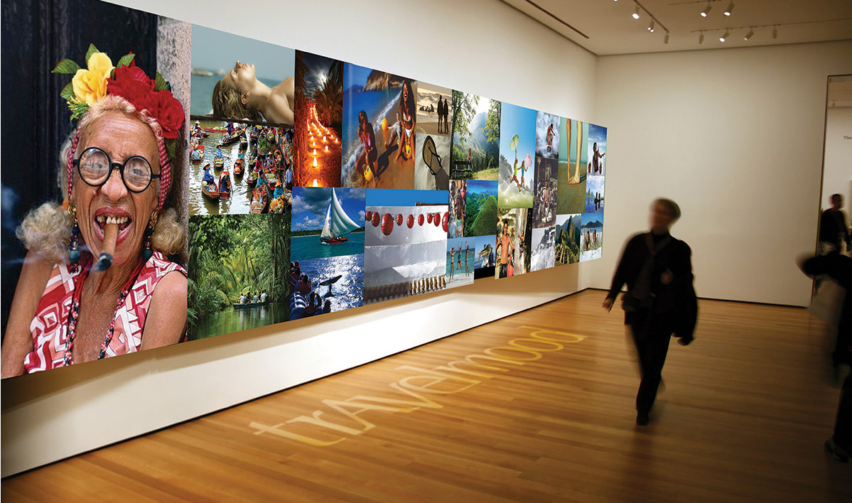
TUI,TRAVELMOOD identity and repositioning:

Long-haul tailor-made specialist travel brand.

The original logo visually split the name of the brand into two words creating a disjointed logo
and an overall aesthetic unrepresentative of the premium product offering.

The new identity utilised an existing font which was redrawn to create a unique typeface,
reflecting the bespoke holiday packages.

In addition the A was flipped and the horizontal bar removed to create the V which was set on
a lowered baseline which in tandem with the A, creates a subtle indication of travelling to and back.

The full colour palette was created using a selection of iconic global references, from New York
taxi yellow to Caribbean seas turquoise.

OLIVER SWEENEY brand consilidation, graphic assets design and diffusion brand identity:

Eponymous luxury shoe retailer.

The brief required a suite of graphic assets, the design of formalised corporate guidelines and creation of a separate diffusion brand.

The result led to focussing on the craftsmanship and micro detailing of the product itself, from the angle of a gentleman’s corner - a notch to prevent a heel from getting caught on or snagging trouser leg bottoms, to a chevron outline formed from the hobnails on the sole of their shoes.

Further elements were created from the pattern of stingray skin - a signature material of the brand for both shoes and accessories.

The existing principal logo was left unchanged but a new secondary font was created using the Made in
Italy imprint - again from the sole of their shoes - as the reference point in its development, this type was used across all brand materials including the diffusion line, Sweeney London.

CAFÉ ROUX identity:

An eponymous brasserie style brand and product offering from the globally renowned Roux gastronomic dynasty.
Using the words Café and Roux as ingredients mixed together to create the combined mark through an abstract play on the form of a chefs ladle.

The fusion of the F and U is a further element representative of the merged international origins of it’s menu.

BIRD STREET identity:

A pop-up retail & leisure destination and London’s first sustainable Smart Street - generating c5 watts of continuous power per pedestrian footstep.

The logo was developed taking creative references from the triangular fold forms of the bespoke retailer pods, designed by HHD, with the colour palette mirroring the scheme. The font based on Agenda Light was developed to include angular cuts making further reference to the architectural design and the smart flooring.

FESTIVAL OF FURNITURE identity:

A five day series of individual retailer events promoting the multiple furniture and homeware offerings located in London’s Fitzrovia.

The festival emblem took it’s inspiration from the dovetail joint featured on the decorative tiling on the facade of the 1917 Heal’s furniture building, a renowned landmark within the district.

A reference to joinery was further utilised by using a carpenters pencil to ‘hand draw’ the two interlocking F’s of the logo.

The adapted ‘wood cut’ font was developed taking its aesthetic from the 19th century arts and crafts movement of which many creative protagonists, synonymous with the area, are associated with.

BOND STREET identity:

London’s capital of luxury retail and leisure.

Formally consisting of Old and New Bond Streets, and divided only by a small pedestrian area, the two streets are collectively known and referred to as Bond Street.

The brand development strategy focussed on it’s geographical location, London, and the date of it’s origin, 1686, which were included in the brand mark to emphasise it’s unique provenance and premium district location.

The font took design references from 17th century typography, with an open multiline aesthetic subtly referencing the two streets which make up the whole.

FALDO HOTELS & RESORTS icon identity:

Eponymous leisure brand from one of the worlds most successful golf player.

The icon is formed by three water splashes and three blades of grass - taking reference from Nick Faldo’s three Major and three Open Championships - interlocked to form an F. The curvature of the elements were by tracing the motion of Faldo’s golf swing.

The colour palette was created using the blue from the Royal & Ancient Golf Club of St Andrews, the founders of The Open and the green from the winner’s jacket of The Masters.

JIMMY BEEZ identity:

Brasserie style restaurant.

Located in London’s famous Portobello Road, a handrawn font was created to reflect both the relaxed nature
of the restaurant and it’s ‘melting pot’ of cultures location.

Elements of the logo were further utilised to create graphic iconography across menus, signage, 3rd party
brand collaborations and merchandise.

PLATINUM BAY identity:

Luxury residential development.

Sited on the west coast of Barbados, next door to the world famous Sandy Lane Hotel, this exclusive
development consists of five detached beach-front villas in a five star managed community.

The identity emblem of an interplaying P and B was inspired by the tropical wind swept arched palm trees, the curvature of a coconut and the gentle lapping of the Caribbean sea, all synonymous with the spectacular location.

ONE WIMPOLE STREET identity:

Royal Society of Medicine’s conference and events venue.

Housed in a traditional Georgian building, the new identity was developed to create a contemporary and contrasting brand mark that reflected the leading edge offering of the venue.

By integrating One, Wimpole and Street into a single ‘word’, the new identity resulted in substantially improved stand-out, specifically online where the brand competes against other venues through specialised listings.

The font took it’s inspiration from the lettering on the exterior stonework with the teal colour being a reference to the Victorian snake sculptures which feature at the entrance to the building.

TUI,TRAVELMOOD identity and repositioning:

Long-haul tailor-made specialist travel brand.

The original logo visually split the name of the brand into two words creating a disjointed logo and an overall aesthetic unrepresentative of the premium product offering.

The new identity utilised an existing font which was redrawn to create a unique typeface, reflecting the bespoke holiday packages.

In addition the A was flipped and the horizontal bar removed to create the V which was set on a lowered baseline which in tandem with the A, creates a subtle indication of travelling to and back.

The full colour palette was created using a selection of iconic global references, from New York taxi yellow to Caribbean seas turquoise.

OLIVER SWEENEY brand consilidation, graphic assets design and diffusion brand identity:

Eponymous luxury shoe retailer.

The brief required a suite of graphic assets, the design of formalised corporate guidelines and creation of a separate diffusion brand.

The result led to focussing on the craftsmanship and micro detailing of the product itself, from the angle of a gentleman’s corner - a notch to prevent a heel from getting caught on or snagging trouser leg bottoms, to a chevron outline formed from the hobnails on the sole of their shoes.

Further elements were created from the pattern of stingray skin - a signature material of the brand for both shoes and accessories.

The existing principal logo was left unchanged but a new secondary font was created using the Made in Italy imprint - again from the sole of their shoes - as the reference point in its development, this type was used across all brand materials including the diffusion line, Sweeney London.
cross